Pingdom Speed Test: Reading the Waterfall and Load Times
AI Summary
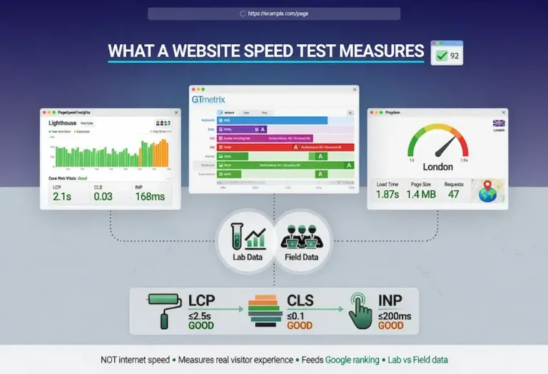
What is the Pingdom speed test? Pingdom is a website speed testing tool owned by SolarWinds that measures load time, page size, request count, and performance grade from server locations around the world. It is the fastest and cleanest speed testing tool available, designed to give you a readable snapshot of page performance without the complexity of a full Lighthouse audit. The free test at tools.pingdom.com is the feature most site owners and SEO practitioners use for quick diagnostics, geographic performance checks, and client-facing reporting.
What this guide covers and who it is for: This guide covers what Pingdom is, how to run a test properly, how to read every metric in the results, how to interpret the request waterfall for diagnosis, how Pingdom handles images and asset weight, server response time and TTFB, third-party script impact, the relationship between Pingdom and Core Web Vitals, direct comparisons with PageSpeed Insights and GTmetrix, how page speed connects to search rankings, using Pingdom for client reporting, and where Pingdom fits in the complete speed testing workflow. It is for site owners, developers, and SEO practitioners who need to know when Pingdom is the right tool, what it tells you that other tools do not, and how to turn its results into actionable improvements.
The bottom line: Pingdom is the tool you reach for when you need a fast, clean answer to “how fast does this page load from this location.” It is not a replacement for PageSpeed Insights or GTmetrix. It is the complement that fills the gaps they leave. Use PageSpeed Insights for the real-user Core Web Vitals data Google ranks on. Use GTmetrix for repeatable lab diagnostics and monitoring. Use Pingdom for geographic load testing, waterfall diagnosis, and the client-facing snapshot that communicates performance in terms anyone can understand.
What Pingdom Is
Pingdom is a website monitoring and speed testing service owned by SolarWinds. Its free page speed test is available at tools.pingdom.com. You enter a URL, pick a test location, and it returns a performance grade, the total load time, the page size, the number of requests, and a waterfall of every resource the page loaded. It is the tool we reach for when we want a clean, fast read on load performance without the depth of a full audit.
What Pingdom does well is clarity and speed. The results load quickly, the layout is uncluttered, and the core numbers are front and center where a non-technical client can understand them at a glance. Where a Lighthouse-based tool gives you a dense audit with dozens of recommendations, Pingdom gives you a snapshot. Sometimes a snapshot is exactly what the situation calls for.
The honest framing: Pingdom is not trying to be a complete Core Web Vitals tool. It focuses on load time and the request waterfall rather than the full suite of modern page experience metrics. It does not report LCP, CLS, and INP the way PageSpeed Insights does. What it offers instead is a fast, geographically specific load test and one of the more readable waterfalls available, and for certain diagnostic jobs that is more useful than another Lighthouse report.
Pingdom also offers paid monitoring services that continuously check uptime and performance at scheduled intervals, but the free speed test is the feature most site owners and SEO practitioners use. This guide focuses on the free tool and how to extract maximum diagnostic value from it.
Running a Pingdom Test
The test is about as simple as it gets: enter the URL, choose a test location from the available regions, and run it. The location choice is the setting that matters most. Pingdom tests from real servers in various parts of the world, and the load time you get reflects the distance and network path between that location and your server.
Choose the test location that matches your actual audience. A business serving customers in the eastern United States should test from a US East location, not from Europe or Asia, because the result from a distant server will show a slower load time than the business’s real visitors experience. If you serve multiple regions, run the test from each one to see how performance varies geographically. A page that loads in 1.5 seconds locally might take 4 seconds from across an ocean, and if you have international traffic, that gap is a real problem worth seeing.
One practical habit: run the test two or three times from the same location before drawing conclusions. The first load may hit an uncached state, and a single test can be skewed by a momentary network condition or a slow third-party response. A few runs give you a more reliable read than one. The first run often shows the worst-case uncached experience, and subsequent runs show the cached performance that most repeat visitors experience.
Test both the homepage and the deepest content pages on the site. The homepage is usually the fastest because it receives the most optimization attention. Deep content pages, particularly those with large images, embedded videos, or complex layouts, often reveal performance issues that the homepage hides. A site that looks fast on the homepage but loads slowly three levels deep has a performance problem that affects real users and real rankings.
Reading the Results
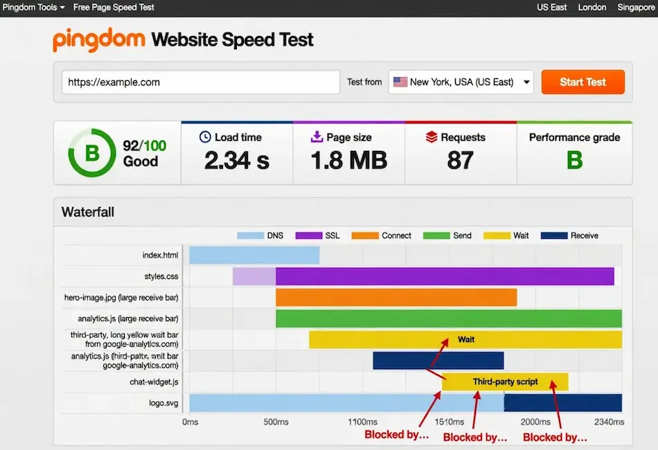
Pingdom returns four headline numbers and a grade. The performance grade is a letter or percentage score summarizing how well the page follows established performance best practices. Below it sit the numbers that tell the real story: load time, page size, and request count.
Load time is the headline, but the other two often explain it. Page size measures the total weight of everything the page downloaded, and a bloated page, usually from large unoptimized images or heavy scripts, directly drives a slow load time. Request count measures how many separate resources the page fetched, and a high count means more round trips, more connections, and more opportunities for something to stall. We frequently see pages making well over a hundred requests, and trimming that count is often a fast performance win.
The relationship between these three numbers is where the diagnostic value lives. A slow load time with a huge page size points at asset weight: optimize the images and scripts. A slow load time with a high request count but modest page size points at request overhead: consolidate and reduce the number of resources. A slow load time with reasonable size and count points at server response time, which is a hosting or backend issue. The numbers triangulate the cause before you even open the waterfall.
What the Performance Grade Means
The performance grade evaluates the page against a set of best practices including browser caching headers, compression (gzip or Brotli), content delivery network usage, image optimization, and script management. A high grade does not guarantee a fast load time, and a fast load time does not guarantee a high grade. The grade tells you how many best practices the page follows. The load time tells you how fast the page actually loads. When they disagree, the load time is the number that matters for user experience and for the ranking signal that Google evaluates.
Where the grade is genuinely useful is as a checklist of missed opportunities. A page that loads fast but gets a low grade is a page where something specific is not following best practices, and fixing it may produce even faster load times or prevent future degradation as the page accumulates more content and complexity.
The Pingdom Waterfall
The waterfall is the most valuable part of the Pingdom report. It shows every resource the page loaded, in the order it loaded, with a visual timeline of how long each resource took from request to completion. Reading the waterfall correctly is the skill that separates people who can diagnose speed problems from people who can only observe them.
Each row in the waterfall represents one resource: an HTML file, a CSS stylesheet, a JavaScript file, an image, a font, an API call, or any other asset the page requested. The horizontal bar shows the timing breakdown for that resource, typically color-coded to show DNS lookup, connection time, TLS handshake, waiting (server response), and receiving (download). The longest bars are the bottlenecks.
The diagnostic pattern is to look for three specific shapes in the waterfall. Long bars at the top indicate a slow initial server response, which is a hosting problem. Clusters of short bars stacked on top of each other indicate too many requests loading in sequence rather than in parallel. Long bars scattered through the middle or bottom of the waterfall indicate specific heavy resources, usually images or scripts, that are dragging total load time. Each shape points at a different fix. A waterfall that shows crawl errors in the form of 404 responses or redirect chains is revealing problems that affect both speed and indexation simultaneously.
One Pingdom-specific detail: the waterfall shows resources in the order they were requested, not in the order they appear in the HTML. This means render-blocking CSS and JavaScript that load early show up at the top of the waterfall even if they are defined in the middle of the page source. The position in the waterfall tells you when the browser needed the resource, which is the information that matters for diagnosis.
Page Size, Images, and Asset Weight
The content size by type breakdown in the Pingdom results shows you exactly where the page weight is concentrated. For most content-heavy sites, images dominate. A single unoptimized hero image can weigh more than the entire rest of the page combined, and Pingdom makes this obvious in a way that motivates action because the numbers are stark.
The benchmarks are straightforward. Total page size under 3 MB is good. Under 2 MB is better. Under 1 MB is excellent. Most sites that exceed 3 MB are carrying unoptimized images, and the fix is the highest-leverage performance improvement available. Converting images from PNG or JPEG to WebP typically cuts file size by 25% to 35% with no visible quality loss. Properly sizing images to the actual display dimensions, rather than loading a 3000-pixel image and CSS-resizing it to 800 pixels, eliminates waste that has no benefit to anyone.
JavaScript weight is the second largest contributor for most sites. Themes, plugins, analytics scripts, chat widgets, and marketing tags all add JavaScript that loads on every page whether that page needs it or not. Pingdom’s content size breakdown reveals the JavaScript share, and when JavaScript accounts for more than 30% of total page weight, it is usually a sign that scripts are loading globally when they should be loading conditionally. The page speed optimization guide covers the complete priority sequence for reducing both image and script weight.
CSS weight is rarely the primary offender, but bloated stylesheets from page builders and theme frameworks can add hundreds of kilobytes of unused rules. The impact is less about download time and more about render blocking, where the browser cannot paint the page until it has processed all the CSS. This is where Pingdom’s waterfall becomes the follow-up tool: identify the CSS files in the waterfall, check their size, and evaluate whether they are render-blocking.
Server Response Time and TTFB
Time to First Byte (TTFB) is the time between the browser requesting the page and receiving the first byte of the response from the server. Pingdom shows this as the “wait” segment in the waterfall for the initial HTML document request, which is the very first row in the waterfall chart.
A healthy TTFB is under 200 milliseconds. Between 200 and 600 milliseconds is acceptable but improvable. Above 600 milliseconds is a clear performance drag that needs attention. The TTFB reflects how fast your server processes the request and begins delivering the response, and it sets the floor that no front-end optimization can break through. A page with a 2-second TTFB cannot load in under 2 seconds regardless of how optimized everything else is.
The common causes of slow TTFB break into three categories. Shared hosting with insufficient resources, where the server is handling too many sites on too little hardware and response times suffer under load. Slow database queries, where the CMS is assembling the page from a database that has not been optimized, and every page load triggers queries that take hundreds of milliseconds. And missing caching, where pages are being dynamically generated on every request instead of being served from a static cache. Each of these creates crawlability problems that extend beyond the single page being tested, because a slow server burns through the limited crawl budget Google allocates to every site before all pages have been reached.
Pingdom is particularly good at isolating TTFB issues because the geographic test locations let you separate server response time from network latency. If TTFB is high from a server that is geographically close to your hosting, the problem is the server itself. If TTFB is high only from distant locations, the problem is network distance, which a CDN can solve. The location-specific testing is what makes Pingdom the right first tool for this diagnosis.
Third-Party Scripts and Performance Killers
Third-party scripts are resources loaded from domains you do not control: analytics platforms, advertising networks, chat widgets, social media embeds, font services, tag managers, marketing automation scripts, and A/B testing tools. Every one of these adds requests, adds weight, and adds a dependency on someone else’s server performance. Pingdom’s waterfall reveals them immediately because the domain column shows which resources come from your server and which come from external sources.
The pattern we see most often is a page that loads fast until a third-party script stalls. The page’s own content is optimized, the server responds quickly, and the images are compressed. Then a chat widget or advertising script takes 3 seconds to load from an external server, and the total load time balloons. The page owner sees a slow result and starts optimizing images that were already optimized, missing the actual bottleneck entirely.
The diagnostic approach is to sort the waterfall by load time and identify which resources are the slowest. If the slowest resources are third-party scripts, the fix is not front-end optimization on your own site. The fix is evaluating whether each third-party script is worth the performance cost it imposes. A chat widget that 2% of visitors use but adds 400 milliseconds to every page load for 100% of visitors is a bad tradeoff. Removing it or lazy-loading it so it only initializes when the visitor clicks the chat icon eliminates the cost for the 98% who never use it.
Tag managers deserve specific attention. Google Tag Manager and similar tools are designed to consolidate multiple scripts into one container, but they can become bloated when marketers add tags without removing old ones. A tag manager loading fifteen tags on every page because nobody audited it in two years is a common Pingdom finding. The fix is a quarterly tag audit that removes anything no longer actively used.
Pingdom and Core Web Vitals
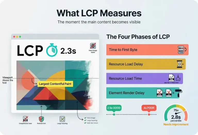
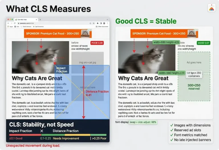
Pingdom does not report Core Web Vitals directly. It does not measure Largest Contentful Paint, Cumulative Layout Shift, or Interaction to Next Paint. These metrics require the Lighthouse engine or real-user monitoring to measure, and Pingdom uses its own testing methodology focused on load time and resource analysis rather than the specific measurements Google uses for ranking.
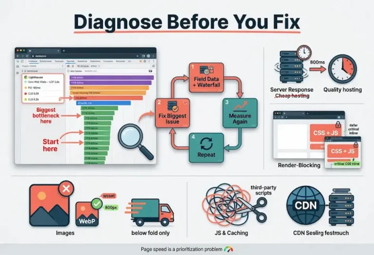
This does not make Pingdom irrelevant to Core Web Vitals. It makes Pingdom complementary. The bottlenecks that Pingdom identifies, including slow server response, heavy images, excessive requests, and blocking third-party scripts, are the same bottlenecks that drag down Core Web Vitals scores. Fixing what Pingdom flags almost always improves the metrics that PageSpeed Insights reports. The tools measure different things but diagnose the same underlying problems.
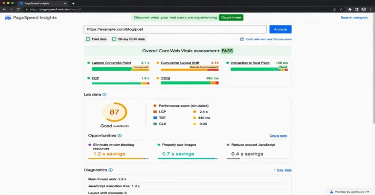
The workflow that produces the best results uses both tools in sequence. PageSpeed Insights first to identify which Core Web Vitals are failing and what the real-user field data shows. Pingdom second to diagnose the specific resources causing the failure through the waterfall. The Core Web Vitals metrics tell you what is wrong. The Pingdom waterfall tells you which specific file, script, or server response is making it wrong.
Pingdom vs PageSpeed Insights
The comparison is not a competition because the tools serve different purposes. PageSpeed Insights is the definitive tool for Core Web Vitals because it reports both lab data from Lighthouse and field data from real users through the Chrome User Experience Report (CrUX). The field data is what Google actually uses for ranking. No other free tool provides this data. If you can only use one speed testing tool, PageSpeed Insights is the one, and it is not close.
Where Pingdom has the advantage is in geographic testing and waterfall clarity. PageSpeed Insights runs from a single location and does not let you choose where the test originates. Pingdom lets you test from multiple locations around the world. For a business with geographically dispersed traffic, or for a business trying to evaluate CDN performance across regions, Pingdom answers questions that PageSpeed Insights cannot.
The waterfall is the other differentiator. PageSpeed Insights provides a list of improvement opportunities with estimated time savings. Pingdom provides the actual request-by-request timeline showing exactly where the time is being spent. For a developer trying to isolate which specific resource is the bottleneck, the Pingdom waterfall is the more actionable diagnostic. PageSpeed Insights tells you “reduce JavaScript execution time by 1.2 seconds.” Pingdom shows you exactly which JavaScript file is taking 1.2 seconds.
The practical takeaway: use both. PageSpeed Insights for the ranking-relevant data. Pingdom for the geographic and diagnostic data. The two together give you a complete picture that neither provides alone.
Pingdom vs GTmetrix
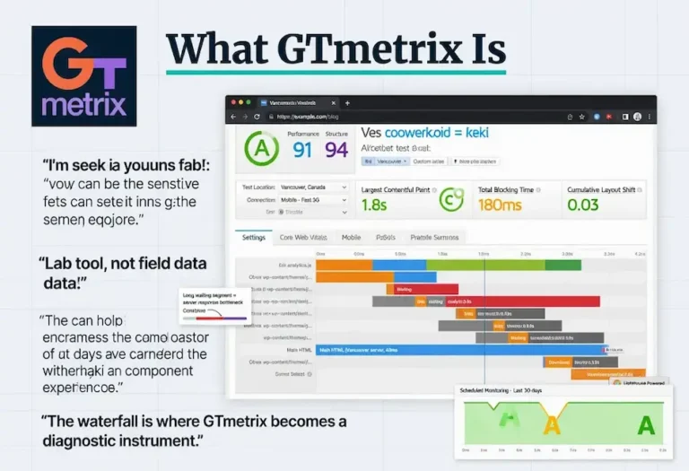
GTmetrix occupies the middle ground between Pingdom’s simplicity and PageSpeed Insights’ depth. It runs the Lighthouse engine, which means it produces the same performance score and many of the same recommendations as PageSpeed Insights. It adds letter grades split into performance and structure scores, a detailed waterfall, and scheduled monitoring that Pingdom’s free tier does not offer.
GTmetrix’s primary advantage over Pingdom is repeatability and monitoring. You can save tests, compare results over time, set up scheduled tests that alert you to performance regressions, and share reports with consistent formatting. Pingdom’s free tool is a snapshot. GTmetrix’s free tier lets you build a performance history.
Pingdom’s primary advantage over GTmetrix is speed and simplicity. A Pingdom test runs and returns results faster than a GTmetrix test. The results are cleaner and more immediately readable. For a quick check during a client call or a fast comparison between two URLs, Pingdom is the faster path to an answer.
The waterfall comparison is close. Both tools provide resource-level timing breakdowns. GTmetrix includes more detail because the Lighthouse engine captures rendering events and long tasks that Pingdom’s engine does not. Pingdom’s waterfall is easier to scan quickly because it includes less information per row. Which waterfall is more useful depends on whether you need a quick read or a deep diagnostic.
The recommendation: use GTmetrix for ongoing monitoring and detailed diagnosis. Use Pingdom for geographic testing and fast snapshots. Use PageSpeed Insights for the Core Web Vitals data that feeds ranking. The three together cover every speed testing need, and the website speed test hub maps how all three fit into the complete testing framework.
Page Speed and Search Rankings
Page speed is a confirmed ranking factor through Google’s page experience signals, which include Core Web Vitals. The relationship is well-documented: pages that meet all three Core Web Vitals thresholds receive a positive ranking signal, and pages that fail may be held back from positions their content quality would otherwise earn. Understanding how Google ranks search results clarifies where speed sits among the many signals the systems evaluate.
The nuance that matters: speed is a tiebreaker, not a primary factor. Content quality and relevance determine most of the ranking. When pages are closely matched on content signals, the faster page can win the position. This means speed optimization produces the most ranking benefit in competitive results where multiple pages offer comparable content quality. In low-competition results, speed matters less because content relevance dominates the ranking decision.
The indirect ranking effects of speed are often more significant than the direct signal. A fast page keeps more visitors engaged. Bounce rate drops. Time on site increases. Users click through to additional pages. These engagement patterns are observable signals that feed back into ranking evaluations. A slow page loses visitors before they can engage with the content, which suppresses the engagement signals that content quality would otherwise produce. Google’s helpful content framework reinforces this from the content side: a page that delivers a genuinely helpful experience, which includes loading quickly enough to be usable, is the standard the systems reward.
Pingdom’s load time metric is not the same metric Google uses for ranking. Google uses the Core Web Vitals from real-user field data. Pingdom measures lab-based load time from a single test. But the same fixes that improve Pingdom’s load time almost always improve the Core Web Vitals metrics that Google does use. The diagnostic tool and the ranking metric are measuring different representations of the same underlying performance. Quality SEO writing gets the visitor to the page. Page speed determines whether they stay long enough to read it.
Using Pingdom for Client Reporting
Pingdom is the speed testing tool that produces the most client-friendly results. The four headline numbers, including load time, page size, request count, and performance grade, communicate performance in terms that a non-technical business owner can understand immediately. “Your homepage loads in 1.8 seconds and weighs 1.2 MB” is a statement that requires no technical background to evaluate.
For client-facing reports, the before-and-after Pingdom test is the cleanest way to demonstrate the value of speed optimization work. Run the test before making changes, screenshot the results, make the improvements, run the test again from the same location, and present both side by side. The visual comparison of a load time dropping from 4.2 seconds to 1.6 seconds is more persuasive than any technical explanation of what was changed.
The geographic testing capability adds another reporting dimension for clients with multi-location businesses. Running the test from three or four locations and showing how performance varies by region reveals either that the CDN is working correctly or that there is a geographic performance gap worth addressing. A client with customers on both coasts who sees a 3-second difference between East and West test locations understands immediately why a CDN matters.
One practice worth building into every client engagement: include a Pingdom snapshot in the initial site assessment alongside the more detailed audits from other tools. The Pingdom snapshot sets the performance baseline in terms the client remembers, and the monthly or quarterly check-in can reference that baseline to show progress. Understanding what an SEO company does includes communicating results effectively, and Pingdom is the tool that makes speed results communicable to everyone in the room, not just the technical people.
Where Pingdom Fits in the Workflow
Pingdom is one tool in a three-tool speed testing workflow. Using it in isolation produces incomplete results. Using it in the right sequence alongside PageSpeed Insights and GTmetrix produces actionable diagnostics that lead to measurable improvements.
The sequence we follow on every site we assess starts with PageSpeed Insights for the real-user Core Web Vitals field data that Google uses for ranking. This establishes the ground truth: where the site actually stands in Google’s evaluation. Second, we run Pingdom from the geographic location that matches the client’s primary audience to measure load time, page size, and request count, and to identify the specific bottlenecks through the waterfall. Third, we use GTmetrix for the deeper Lighthouse-based diagnostic and set up monitoring to catch regressions after the fixes are implemented.
The workflow is not a one-time event. Speed degrades over time as content is added, plugins are updated, and third-party scripts accumulate. A site that passes all Core Web Vitals today can fail them six months from now without any deliberate changes, simply from the weight of incremental additions that nobody tracked. The discipline of cadence applies directly to speed testing: monthly checks catch the drift before it costs rankings or conversions. A comprehensive SEO site audit includes speed testing as one component of the technical evaluation, but the speed checks should happen more frequently than full audits because performance can change after a single plugin update.
For the broader framework on how speed testing connects to the complete SEO discipline, including content strategy, technical health, and authority building, the Complete SEO Knowledge Base maps the full landscape. The crawlability discipline covers the technical foundation that speed testing supports, and the calibration discipline covers the measurement and adjustment cycle that keeps speed improvements from decaying over time. The on-page SEO checklist includes several items that overlap directly with speed optimization, including image compression, heading structure, and internal linking that creates the crawl paths search engines follow through the site.
This is part of what we do at Star Diamond SEO. A technical audit identifies exactly which bottleneck is holding your pages back, and the fix is prioritized by impact rather than applied as a generic checklist. If you would rather have page speed handled as part of a complete technical foundation than learn the full discipline yourself, you can see our technical SEO services or request a free audit that includes a performance review of your top pages.
FAQ
What does Pingdom measure that other speed test tools do not?
Pingdom’s primary differentiator is geographic load testing. You choose a test location from servers around the world, and the results reflect how the page performs from that specific region. PageSpeed Insights runs from a single location and does not let you choose. GTmetrix offers location selection on paid plans but defaults to a single location on the free tier. Pingdom also produces one of the most readable request waterfalls available, making it faster to identify specific bottlenecks than tools that bury the same information in dense audit reports.
Is Pingdom accurate for SEO purposes?
Pingdom measures load time, page size, and request count, which are useful diagnostics but are not the same metrics Google uses for ranking. Google ranks pages based on Core Web Vitals field data from real users, which Pingdom does not report. However, the bottlenecks Pingdom identifies are the same bottlenecks that drag down Core Web Vitals scores. Fixing what Pingdom flags almost always improves the metrics Google does use. Pingdom is an accurate diagnostic tool that complements the ranking-specific data from PageSpeed Insights.
What is a good Pingdom load time?
A load time under 2 seconds is good. Under 1.5 seconds is strong. Under 1 second is excellent. These benchmarks assume testing from a location geographically close to the server. Load times from distant locations will be higher due to network latency, which is expected and does not necessarily indicate a problem with the site itself. Always test from the location that matches your actual audience to get a meaningful result.
Should I use Pingdom or PageSpeed Insights?
Use both. They serve different purposes and produce different data. PageSpeed Insights provides the Core Web Vitals field data that Google uses for ranking, making it essential for understanding your actual standing in search. Pingdom provides geographic load testing and a cleaner waterfall for diagnosing specific bottlenecks. Start with PageSpeed Insights to know where you stand, then use Pingdom to identify exactly which resources are causing any problems.
How often should I run a Pingdom speed test?
Test your top pages monthly and after any significant change to the site such as a theme update, new plugin installation, or addition of third-party scripts. Speed degrades over time as content and complexity accumulate, and a page that passed its benchmarks six months ago can quietly fall below them without any deliberate change. Monthly testing catches the drift before it impacts rankings or user experience.